Painting a 3D printed logo
 Chris Ellerby
Admin
in Painting
I just finished a quick logo project for a friend, and I figured it would be a good idea to show my painting/finishing process here.
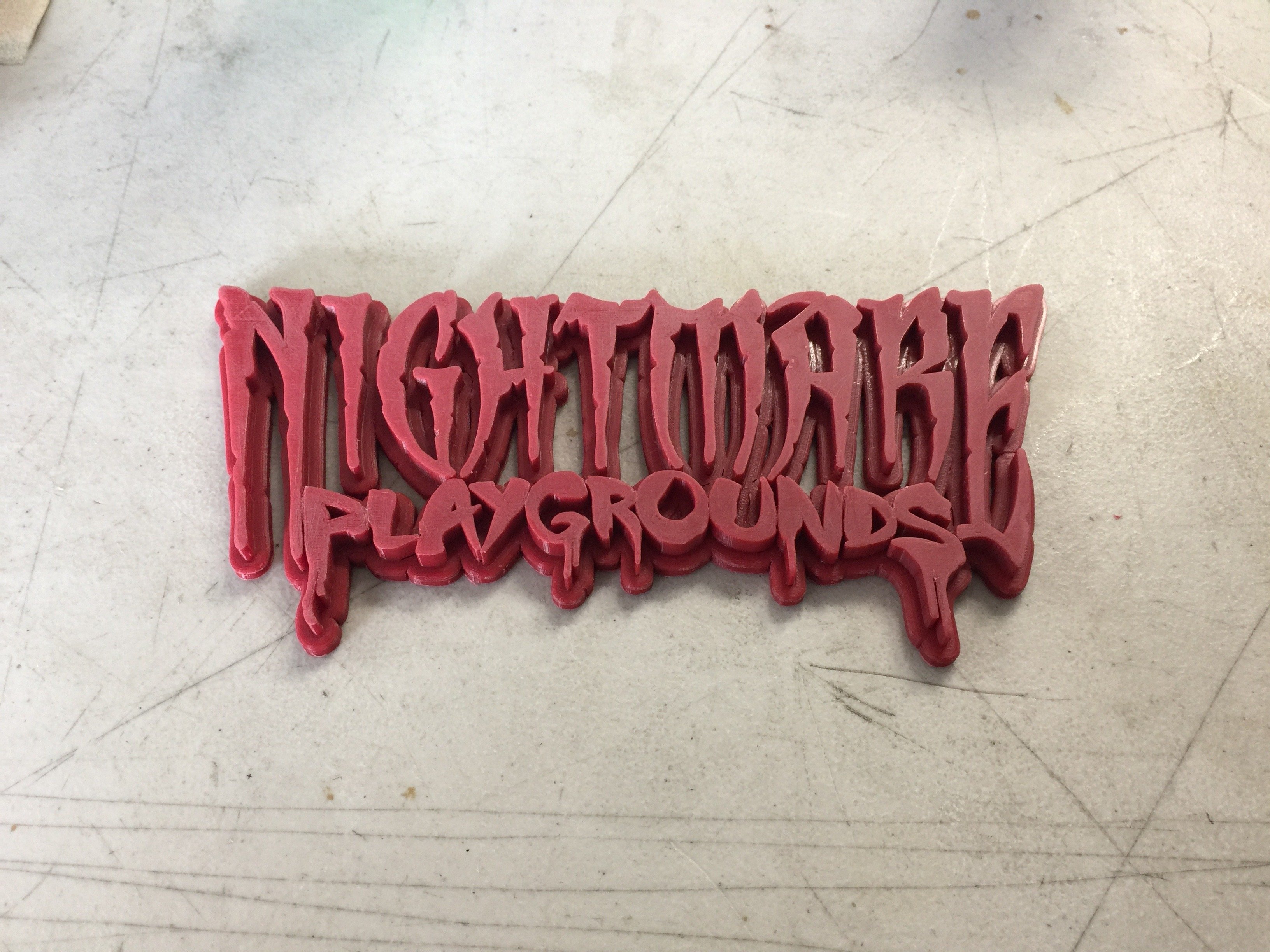
Here is the 3D printed logo, fresh off the printer. Before paint I used small needle files to clean up some of the details, and various grits of sandpaper to remove the print lines and round off sharp corners. This print was pretty high quality, so very little prep was needed. I then washed off the surface with 99% isopropyl alcohol to remove any grease from handling before moving on to the next step.
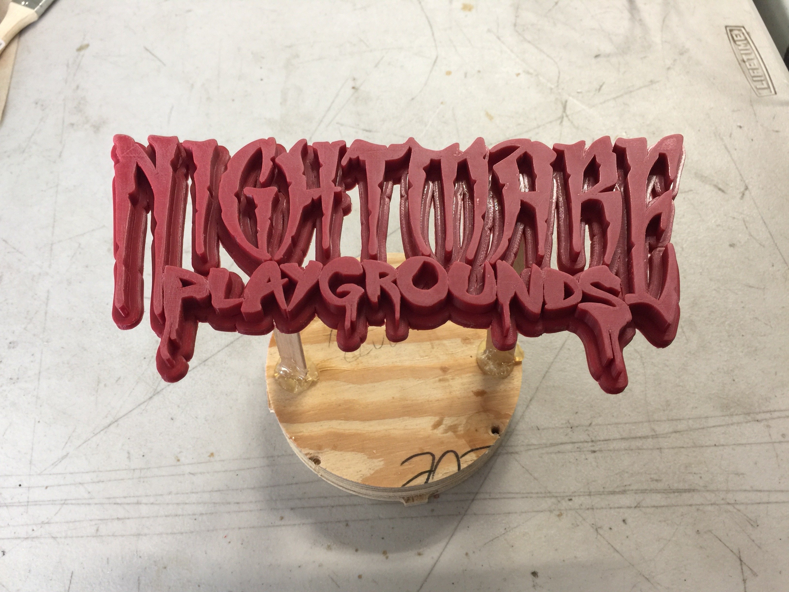
Next I used hot glue to mount the logo to some standoffs and a base so it would be easy to handle while painting. Because I will be going for a distressed metal look, I also hit the surface with 150 grit sand paper. I tried to leave a lot of diagonal lines and scratches going in the same direction to help create a weathered metal look. At this time I also chipped and dented the surface and edges a bit using small metal objects.
Next I gave the logo 3 layers of gold paint. I want a good amount of thickness, as I plan to sand and distress the surface more later.
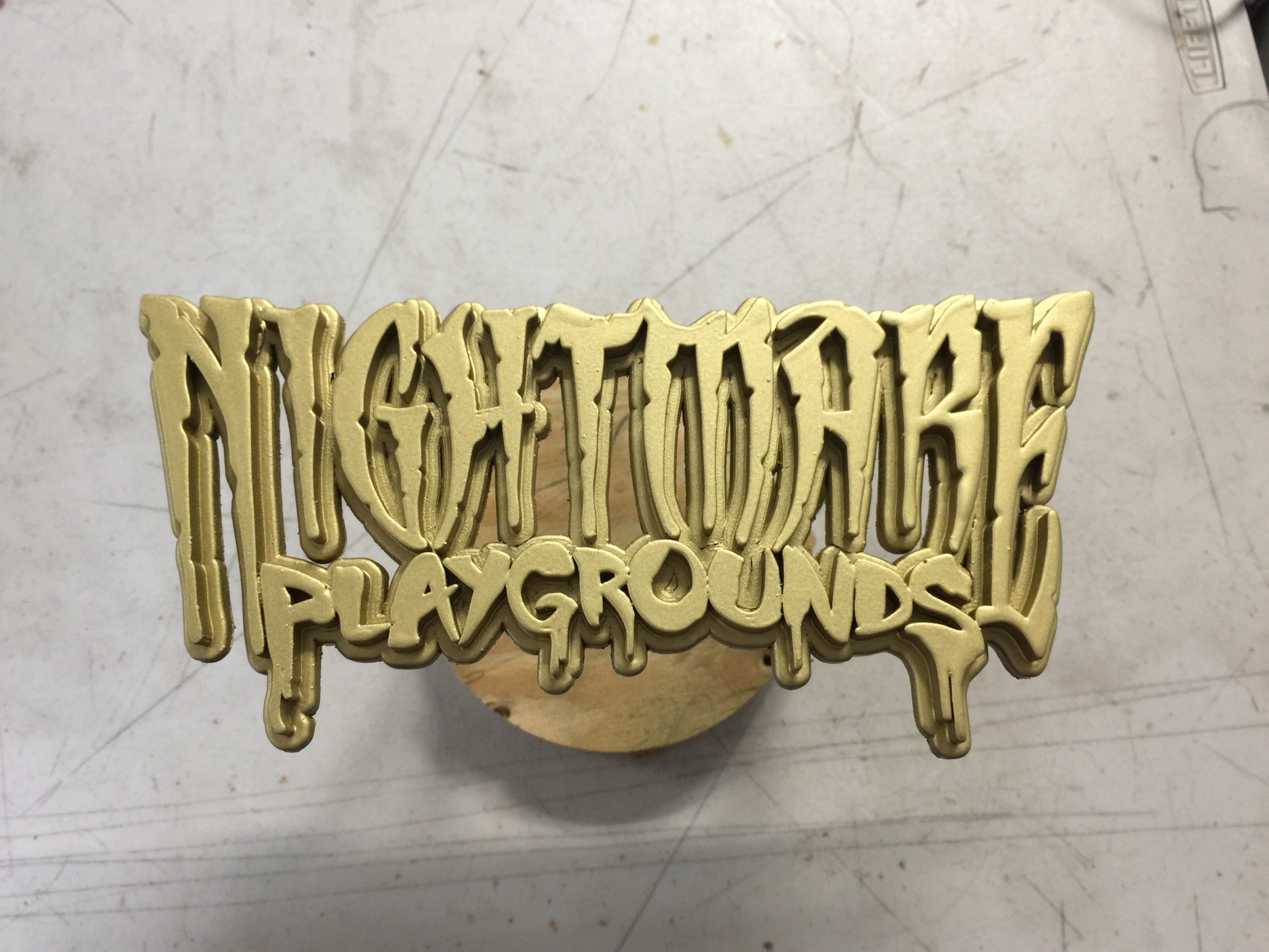
Rather than waiting the full 2 hour cure time on the paint I used a heat gun. This was a bit of a delicate operation, as the PLA plastic will quickly melt if I turn up the heat gun too much, get too close, or move too slowly.
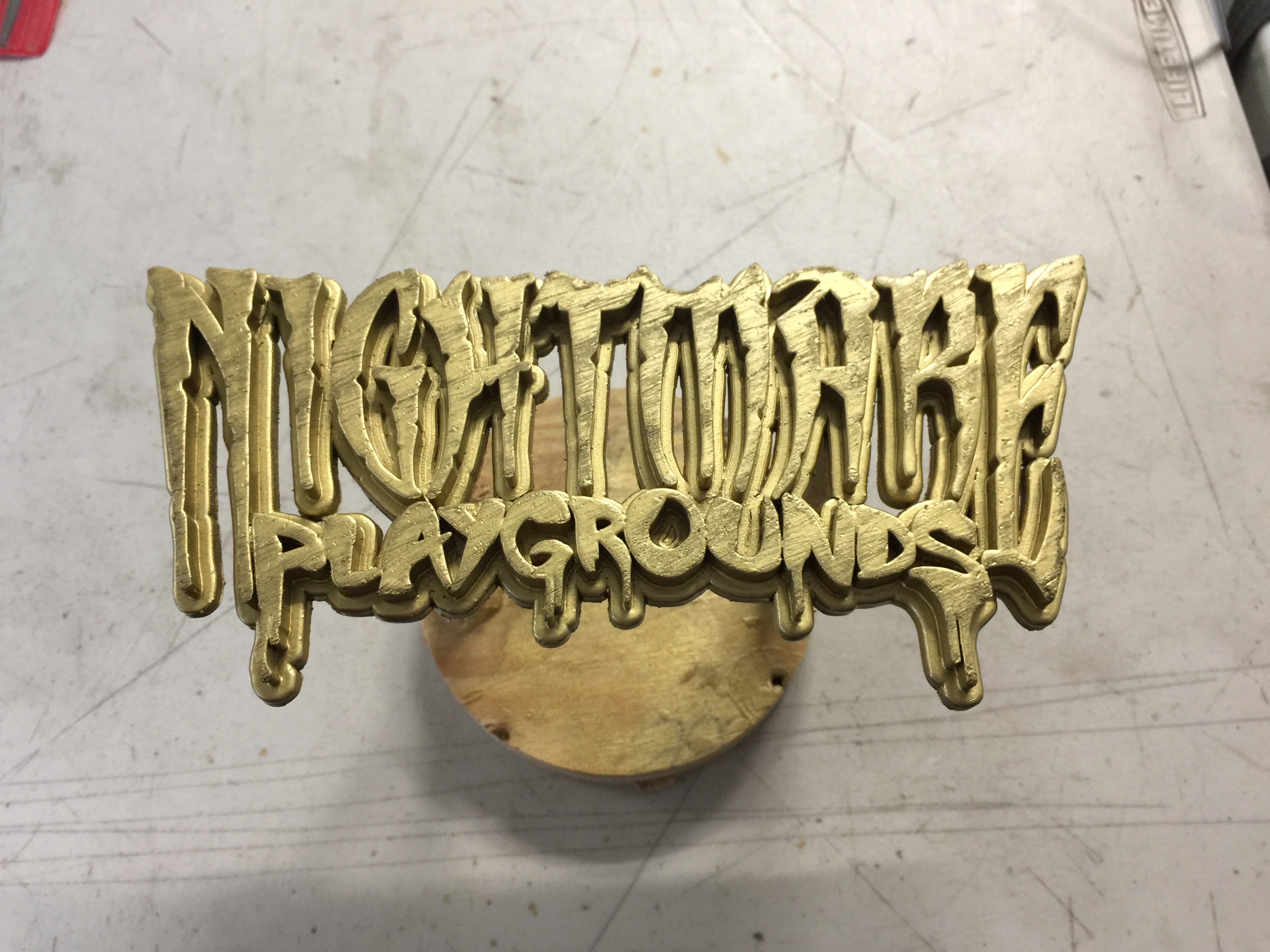
Once the paint was dry enough, I roughed up the surface more and added more diagonal scratches with sandpaper. I also added some pitting by tapping on the surface with small metal objects. All of this distressing will be picked up by the acrylic washes in the next few steps.
I started with a few rounds of black acrylic wash. The first was a thick muddy mixture that was mostly acrylic paint with just a bit of water and some 99% alcohol. The more alcohol you add, the faster it will dry. If you add too much alcohol the acrylic paint will not disperse evenly into the wash, so you have to get the balance just right. The thicker wash was then wiped away with a rag, leaving the high points clean. I then moved on to a thinner black wash in a spay bottle. This helps to break up and mottle the surfaces a bit. It's important when using washes to allow each layer to dry fully before moving onto the next, especially between colors. If you are not careful the moisture in a new layer will re-activate an older layer, and your layers will either blend together or get removed. To help prevent this I used the heat gun to thoroughly dry each layer.
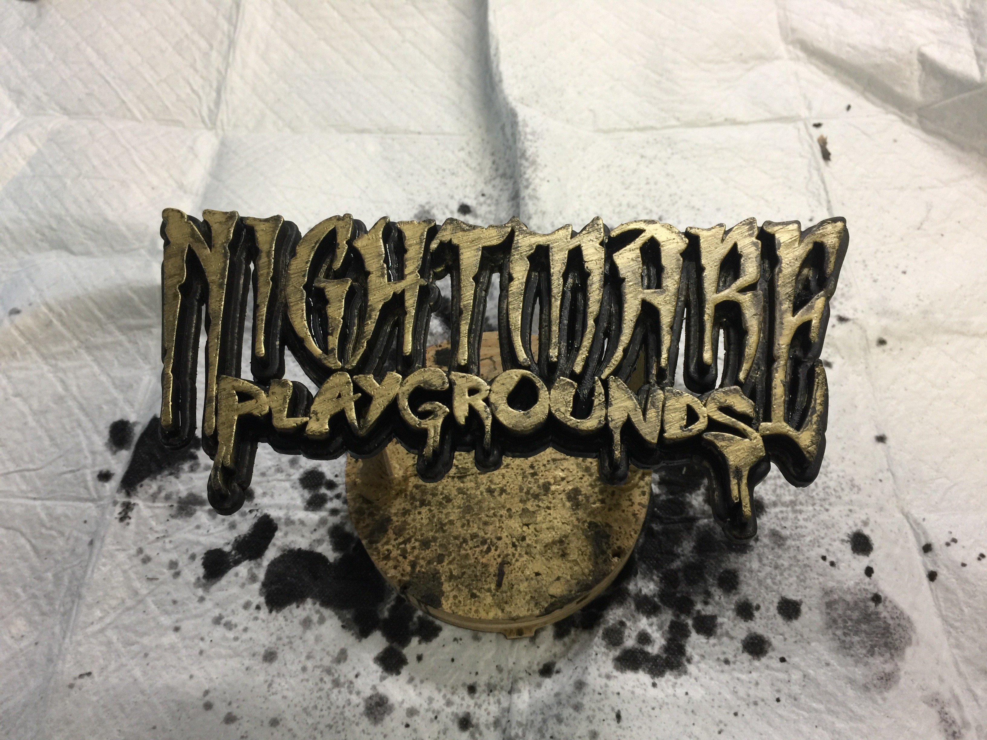
Next I moved on to the browns. The first pass was a dark brown to simulate dirt and grime, then I moved on to more orange/red browns to simulate oxidization. All of the brown washes were sprayed on in many layers to slowly build up color and keep things looking organic. With each layer I would dab the surface dry, leaving the coloration a bit uneven.
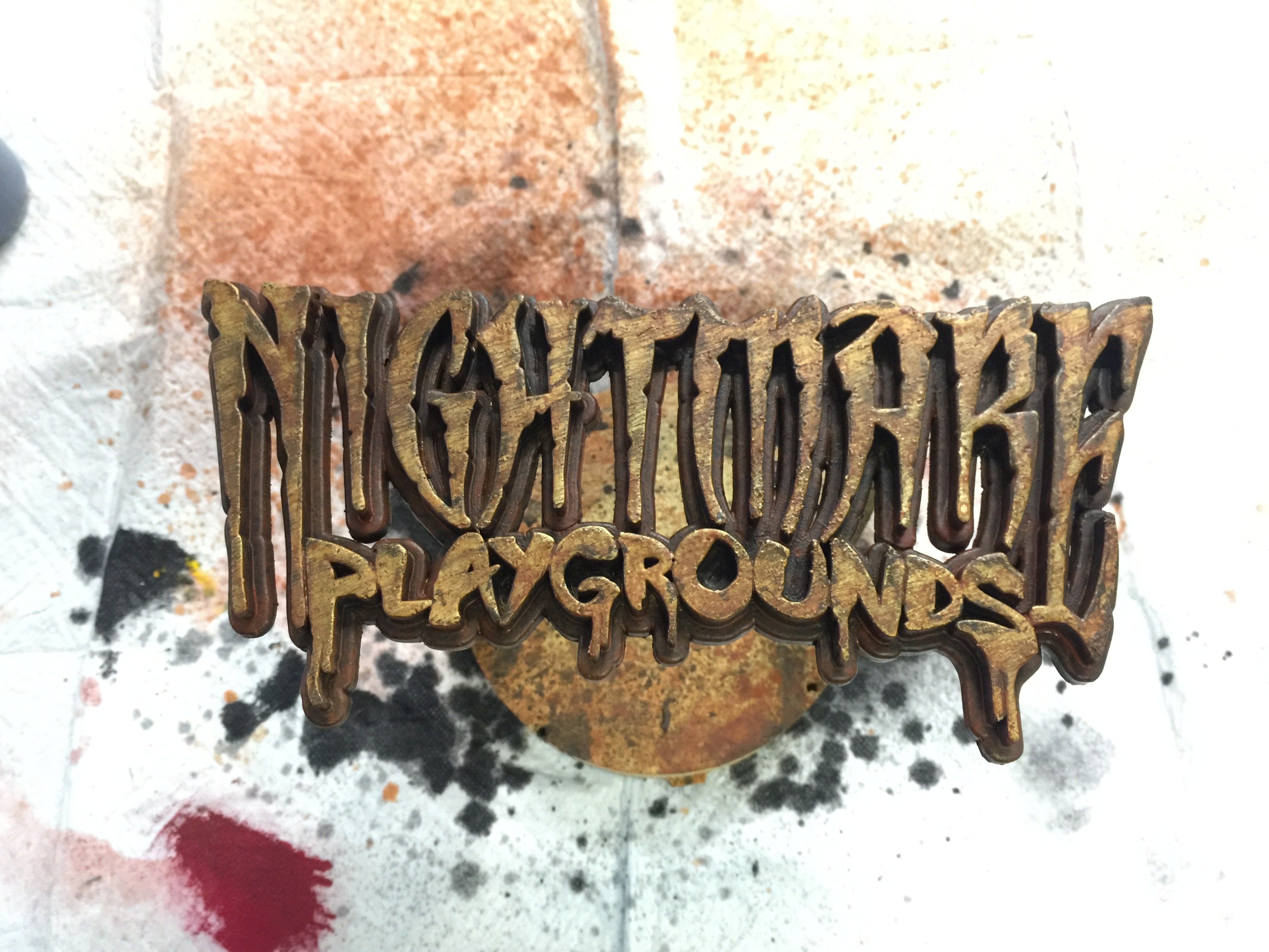
The final round of washes (and my personal favorite) is a light green patina. These layers were each sprayed on and allowed to drip and pool naturally. I had to be careful while drying these layers with the heat gun, as I did not want to disturb the shape of the drips and pools.
Once the last layer of patina was dry I cleaned off the surface of the letters with some 99% isopropyl alcohol to brighten them up a bit (while still leaving some of the color) and then scuffed the surface and edges a bit with 150 grit sand paper to bring back more of the gold shine. This is why I used 3 layers of gold spray paint at the beginning, as I knew some of it would be removed during the final sanding.
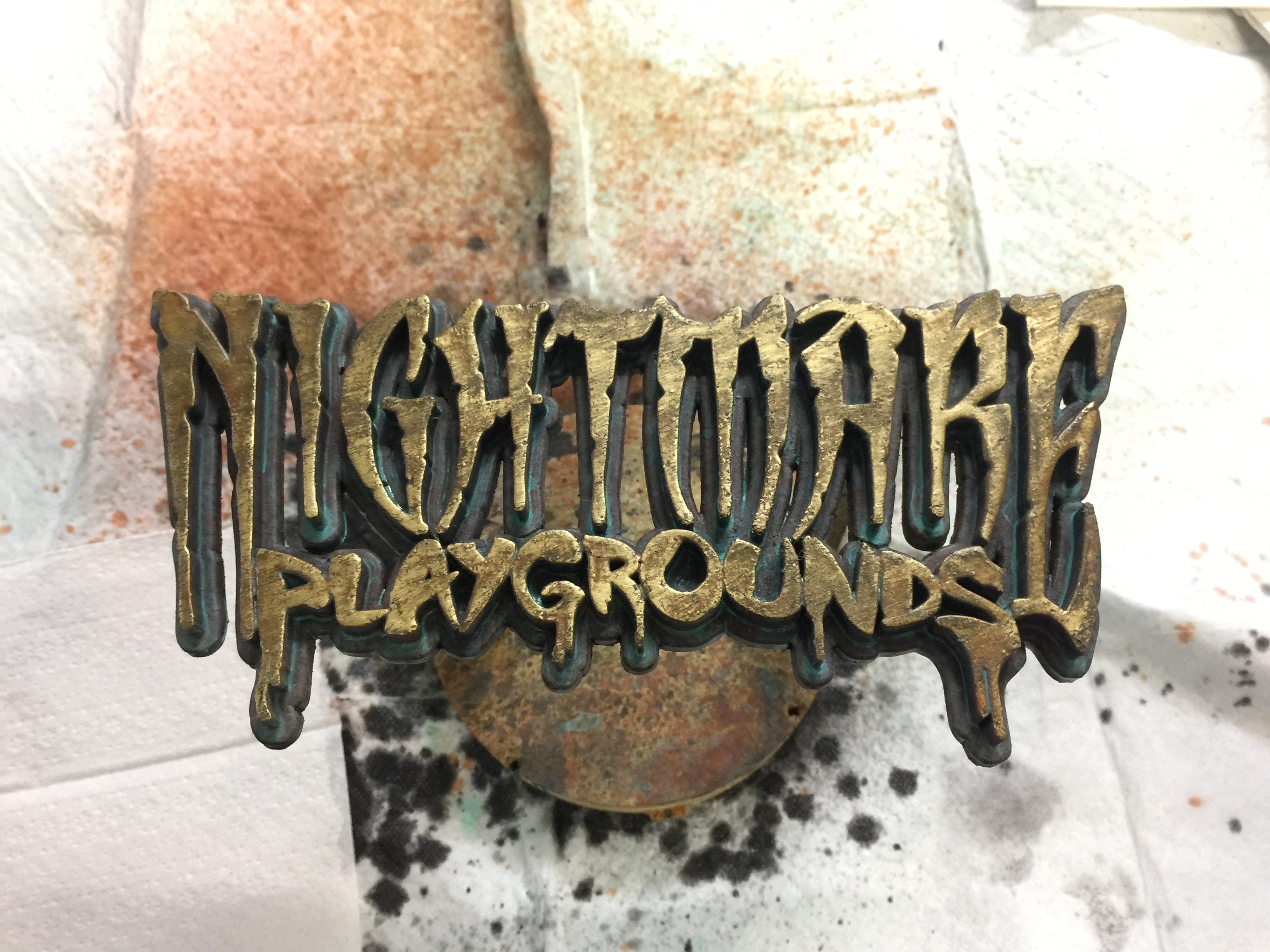
I then sealed the entire logo with Krylon Crystal Clear, and will soon be hitting that with a Krylon matte clear coat to knock back the shine of the Crystal Clear a bit. I'll post a nice photo of the finished logo soon.
/Chris
Here is the 3D printed logo, fresh off the printer. Before paint I used small needle files to clean up some of the details, and various grits of sandpaper to remove the print lines and round off sharp corners. This print was pretty high quality, so very little prep was needed. I then washed off the surface with 99% isopropyl alcohol to remove any grease from handling before moving on to the next step.

Next I used hot glue to mount the logo to some standoffs and a base so it would be easy to handle while painting. Because I will be going for a distressed metal look, I also hit the surface with 150 grit sand paper. I tried to leave a lot of diagonal lines and scratches going in the same direction to help create a weathered metal look. At this time I also chipped and dented the surface and edges a bit using small metal objects.

Next I gave the logo 3 layers of gold paint. I want a good amount of thickness, as I plan to sand and distress the surface more later.

Rather than waiting the full 2 hour cure time on the paint I used a heat gun. This was a bit of a delicate operation, as the PLA plastic will quickly melt if I turn up the heat gun too much, get too close, or move too slowly.
Once the paint was dry enough, I roughed up the surface more and added more diagonal scratches with sandpaper. I also added some pitting by tapping on the surface with small metal objects. All of this distressing will be picked up by the acrylic washes in the next few steps.

I started with a few rounds of black acrylic wash. The first was a thick muddy mixture that was mostly acrylic paint with just a bit of water and some 99% alcohol. The more alcohol you add, the faster it will dry. If you add too much alcohol the acrylic paint will not disperse evenly into the wash, so you have to get the balance just right. The thicker wash was then wiped away with a rag, leaving the high points clean. I then moved on to a thinner black wash in a spay bottle. This helps to break up and mottle the surfaces a bit. It's important when using washes to allow each layer to dry fully before moving onto the next, especially between colors. If you are not careful the moisture in a new layer will re-activate an older layer, and your layers will either blend together or get removed. To help prevent this I used the heat gun to thoroughly dry each layer.

Next I moved on to the browns. The first pass was a dark brown to simulate dirt and grime, then I moved on to more orange/red browns to simulate oxidization. All of the brown washes were sprayed on in many layers to slowly build up color and keep things looking organic. With each layer I would dab the surface dry, leaving the coloration a bit uneven.

The final round of washes (and my personal favorite) is a light green patina. These layers were each sprayed on and allowed to drip and pool naturally. I had to be careful while drying these layers with the heat gun, as I did not want to disturb the shape of the drips and pools.
Once the last layer of patina was dry I cleaned off the surface of the letters with some 99% isopropyl alcohol to brighten them up a bit (while still leaving some of the color) and then scuffed the surface and edges a bit with 150 grit sand paper to bring back more of the gold shine. This is why I used 3 layers of gold spray paint at the beginning, as I knew some of it would be removed during the final sanding.

I then sealed the entire logo with Krylon Crystal Clear, and will soon be hitting that with a Krylon matte clear coat to knock back the shine of the Crystal Clear a bit. I'll post a nice photo of the finished logo soon.
/Chris
0
Comments
Thats what i need for my fence, those mixed colors.