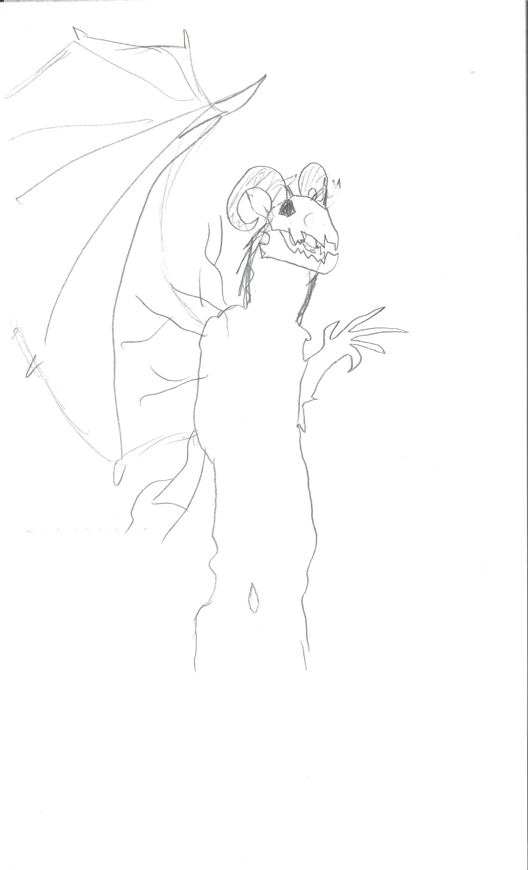
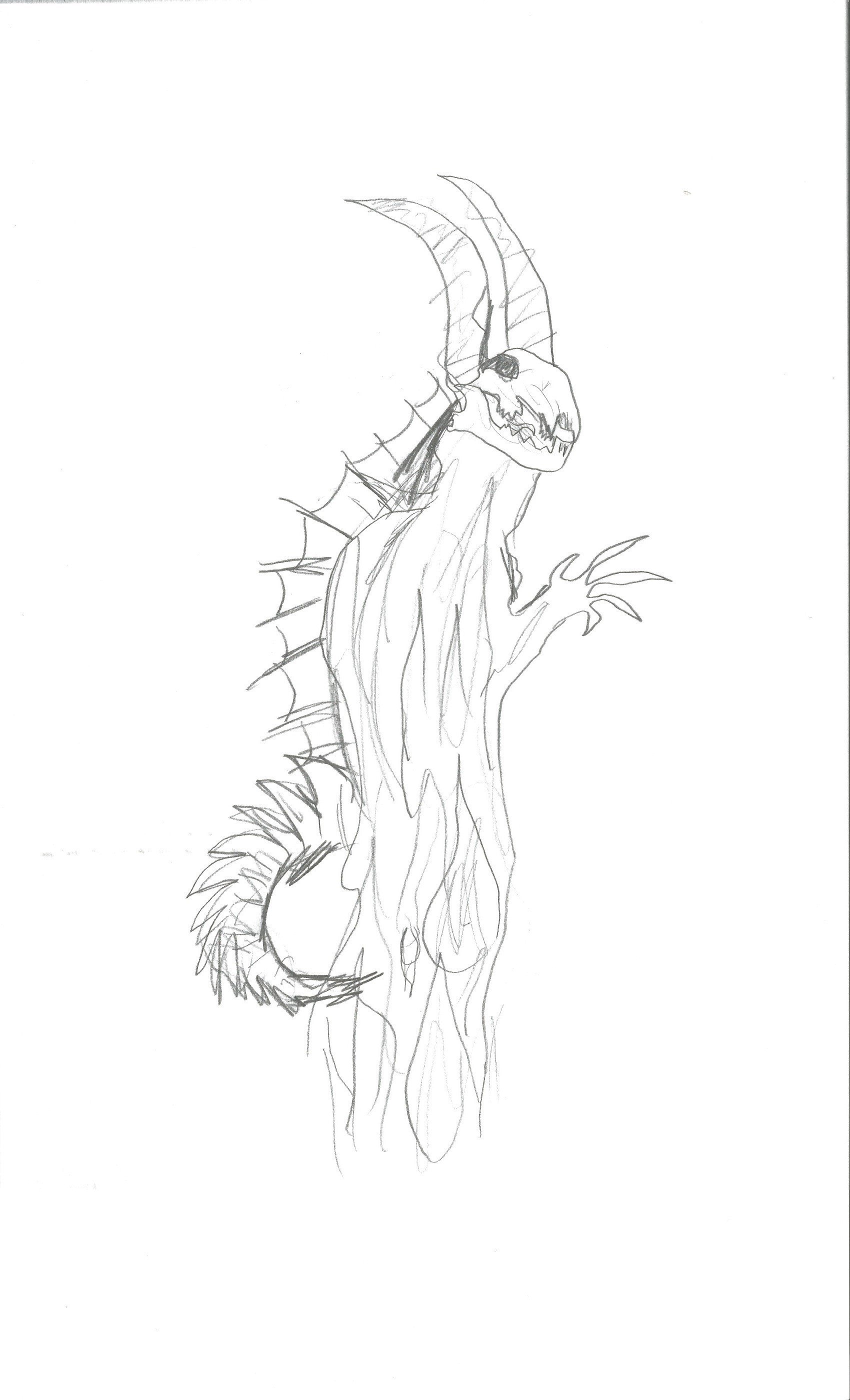
Sketches-Homework: My NecroStrider Creature For Jeffery Warren Park
Hi Jeffery! I've included 4 sketches of the NecroStrider. I thought the concept of wings were an interesting idea...maybe add a tail, definitely more texture for the skin. I was brainstorming & found some "Queen Palm Trees" the skin on them was old & decaying,but it kind of looked like skin and bone, I was thinking I could use them for the skin. I've requested "Drawing On The Right Side Of The Brain" at my library. I should get it soon. Thank you so much for the opportunity!!.Enjoy!! ![]()


1
Comments
I appologize for the long delay in replying. But, hopefully you can understand that work can often get in the way at times. Unfortunately, I have been bogged down with several work projects all at once, and it had to take priority.
I agree that wings are an interesting idea. But, unfortunately, I think they may be a bit beyond the scope of this particular project. (Remember, you need to crawl, before you can walk, before you can run, before you can compete in marathons. Wings, are a metaphorical marathon!)
At this time, I think you need to spend more time on the basic design, rather than how to make it look like it could fly. Let the wings go for now. For now, think about the character of your creature, and how you can convey that in it's shape and form.
To give you some examples: (Of course, this being the STAN WINSTON School of Character Arts, it only makes sense for the examples be Stan Winston creations. ;-) ) 1. Predator- for most of the movie, all you see of the character is his silhouette, distorted though it may be. Nevermind the production problems and onset drama. It's the silhouette that defined the character, until its true face was finally revealed. 2. Pumpkinhead- for much of the movie you only see it as a shadowy silhouette, with the occasional claw and foot seen. When this character was finally revealed in full, you were on the edge of your seat, eager to see more. 3. Aliens- while almost everybody knows about how these characters look now, after so many sequels, (both good and down right horrible trash), it is again, the silhouettes that helped define them. From the warrior-class aliens scurrying across ceilings like cockroaches, to the queen alien herself, it was the silhouettes you saw first. Yes, the designs were loosely based on H.R. Giger's original design. But, Jim Cameron and Stan Winston defined your first impressions through the visible forms seen in the shadows.
All three of these examples involved men-in-suits. One even included stilts. But, what you see is complete characters, not an actor in a costume, possibly on stilts. You see the characters!
Remember, you are designing a three-dimensional being, not just something two-dimensional, on paper. The moment it moves, and turns around, it still needs to be considered. A fin down the back may seem really cool, but how does it relate to the character. How do you justify it having fins. Is your character aquatic? If so, then it would need fins in more places than just it's back.
Think about it. This goes for ANY new detail you decide to add to your character. It ABSOLUTELY has to have a GOOD REASON for being there. If it doesn't..., then it doesn't belong.
To give yet another example: 4. The "Cthogua" from the movie, "The Relic". (Another man-a-suit creation from Stan Winston, btw.) Yes, it was a mis-mash of a large number of animals and other creatures, but each one that was incorporated had a reason for being there. They were all important parts of the overall character. They weren't just added, "because they looked cool". They were a part of not just the character, they were a part of the overall story.
There are MANY more examples I could give you, and not just from Stan Winston's resume', but from the entire history of film and beyond. But, I think that should be enough for you to get the idea.
I think maybe you should take a step back, and work out a THOROUGH back-story about your character... Imagine you were asked in an interview, by an aspiring new director, that wanted to feature your character in her or his next movie. How would you convey to them, the "who, what, where, when, and why" that this character exists? What can you do to inspire them to base an entire film around your creation. This might sound a little daunting. But, it is very basic. If you were going to the latest "creature-feature" movie with your friends, and it reached the point of "the big reveal", would your creation truely be awe-inspiring? Would it make all your friends say, "Wow! That was the best creature/ character I've seen in a movie since..., (pick your own favorite critter). I'd love to see it face off against..., (again, pick one), that would kick it's butt!!!" Or, would your friends just say, "Yeah..., that was kinda a cool costume... Hey! I hear (pick a new movie) is opening, I hear it's got a lot of cool characters and stuff. Let's go!" See what I mean... How well you create your design can really impact whether it is considered a success, or an utter disaster. This is NOT to say you are not on the right path. It is just that you haven't tried to push the design far enough, yet.
There is a SWSCA class called, "Zbrush character design - Dynamic thumbnail techniques", by Cesar Decol Jr., that I think you should check out. Yes, it's intended for Zbrush, but forget about that. The information he talks about is DESIGN, which translates EVERYWHERE, not just in that particular program. He just uses it to help illustrate his design process. (It's like traveling, it doesn't matter what vehicle you use, it's how you get from point "A", to point "B"!)
This reply has gotten a "bit" long. But, hopefully, it makes some sense to you. By all means. KEEP AT IT!!! And, don't just listen to me, there are A LOT of fantastic artists here. Don't be afraid to ask for advice from them, also. Quite a few are VERY generous with their time, and great advice. The only questions that are truely stupid are the ones you don't ask. But, no matter what, DO NOT STOP CREATING!!! IT IS THE ONLY WAY TO GET BETTER!!! Now, get back to work. ;-)
-Jeffrey Warren Park
/Chris